Explore the essentials of interpreting demographic data using percentage points and visual aids for clearer insights into population trends.
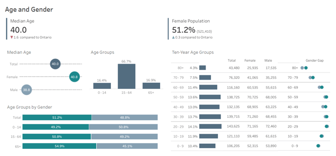
Data variances are presented in percentage points rather than percentage changes to provide precise differences. The dashboard uses percentage points to clarify these variances, helping to prevent the common confusion associated with percentage differences. For example, if the female population in one region is 53.7% and in another is 51.3%, this discrepancy is expressed as 2.4 percentage points, not as a percentage change.
Visual Representation and Color Coding:- The dashboard color codes demographic data, using green for females and blue for males, simplifying the visualization of population distributions across different age groups.
- Visual tools show gender distribution within age groups, highlighting the numerical difference between males and females. For example, in the oldest age group, if there are significantly more females than males, the visual will indicate the numerical gap.