How to interpret the map's color-coded quintiles. When analyzing the choropleth map, the quintile distribution for each indicator categorizes Census Subdivisions (CSDs) within the selected province according to their relative statistics.
First select a province and an indicator
- Choose a province from the dropdown menu
- use the hamburger menu (3 horizontal lines) and select an indicator.
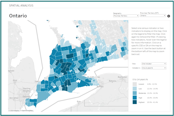
For this example select either the "% of Population Aged 0-14" or "Median Household Income" to display on the map.
Interpreting quintiles
Highest quintile (darkest shade): These CSDs score in the top 20% for the chosen indicator compared to all other CSDs in the province.
This suggests:
- For age: These are areas with the highest proportions of young populations, potentially requiring more educational and recreational facilities.
- For income: These are the wealthiest areas, which might have better infrastructure and services.
- For age: Fewer young residents, which might influence the types of community services and infrastructure needed.
- For income: Lower economic conditions, possibly requiring targeted economic support and social services.
Conclusion
This quintile-based analysis allows for a nuanced understanding of regional variations within a province. By categorizing CSDs relative to each other, stakeholders can identify areas of priority for resource allocation, policy-making, and community planning based on the specific needs highlighted by the census indicators.
This quintile-based analysis allows for a nuanced understanding of regional variations within a province. By categorizing CSDs relative to each other, stakeholders can identify areas of priority for resource allocation, policy-making, and community planning based on the specific needs highlighted by the census indicators.