The Spatial Analysis tab allows users to compare geographic areas based on various indicators. This guide will walk you through selecting your province, choosing an indicator, and comparing Census Subdivisions (CSDs) using the proportion percentage (%).
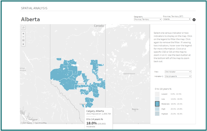
This interactive choropleth map displays selected census indicators such as the percentage of the population aged 0-14 years and median household income across different Census Subdivision (CDS) areas within Canadian provinces. The data are grouped into quintiles for each indicator and visualized using a color scale where darker colors represent higher values, and lighter colors indicate lower values.
Choose Your Province
- Begin by navigating to the Spatial Analysis tab.
- Select your desired province from the available options in the drop down menu.
Zoom into a CSD
- You can view as a province, or zoom into a CSD of your choice for a more detailed view.
- Click on the hamburger menu (three horizontal lines) located in the upper right corner.
- To switch between indicators, use the control panel located next to the map. Click on the indicator you wish to view, and the map will update to reflect this data.
Interacting with the Map
- With the indicator selected, click on the indicator level option you wish to view. The map uses a sequential color scale to represent data values in quintiles.
- Darker shades signify higher quintiles (higher data values).
- Lighter shades signify lower quintiles (lower data values).
- Refer to the color legend on the map to understand the value ranges represented by each color. (to view a specific range click on that range in the legend)
- Hover over any CDS to see a tooltip with detailed information, such as the exact value of the selected indicator for that area.
- You can zoom in and out using the zoom controls on the map for a closer look at specific areas.
Tips for Effective Use
- Use the map to identify patterns and trends across different regions.
- Compare data between different CDSs to understand regional disparities or similarities.
- Utilize the downloaded data for detailed, personalized analysis or reporting.