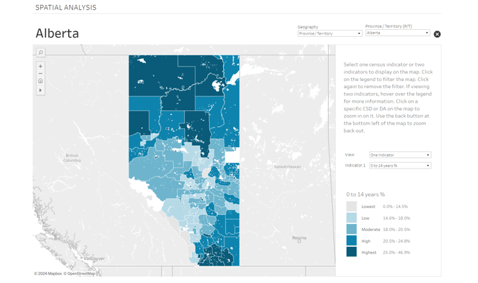
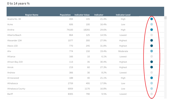
The coloured dots in the table correspond to the colours on the map and indicate different levels of the selected census indicator. The lighter the colour, the lower the percentage, and the darker the colour, the higher the percentage.
These dots provide a visual reference to quickly understand the indicator levels across different regions on the map.